Grade5
An educational platform introduced to Sri Lankan community as an aid for the kids who face scholarship examination.
Overview
Grade5 is an educational platform introduced to the Sri Lankan community as an aid for the kids who face scholarship examination.
We had great success than expected with the first release of the Grade5 application with over 10,000 user registrations.
For the second phase of the app, the main goal was to improve conversion and attract new users with a new best-in-class website. I partnered with our UX team and collaborated with a small team of developers to design and build a fluid digital experience with an up-to-date visual style that carries a feeling of glamour and grandeur.
My Role
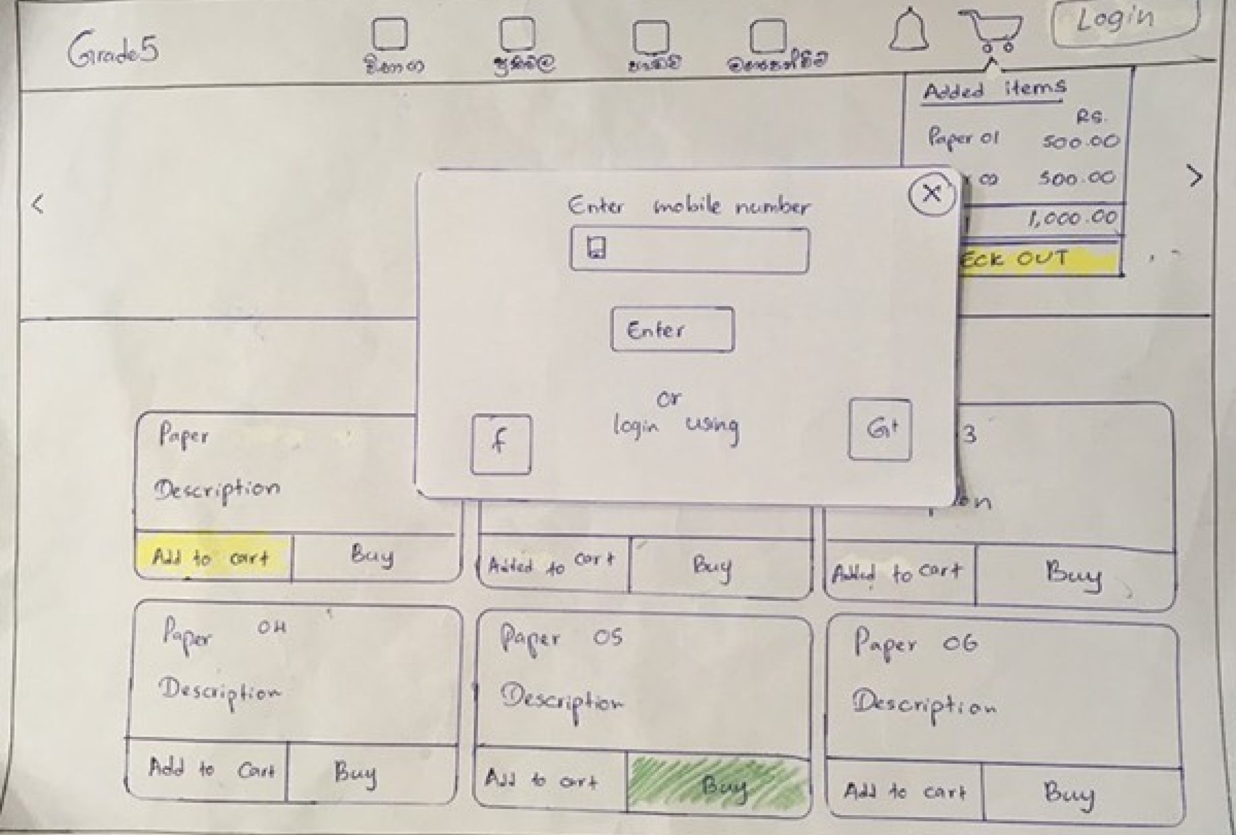
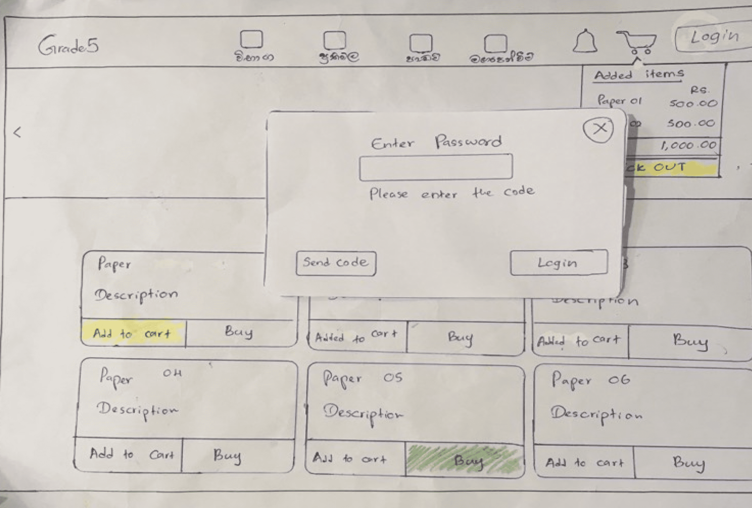
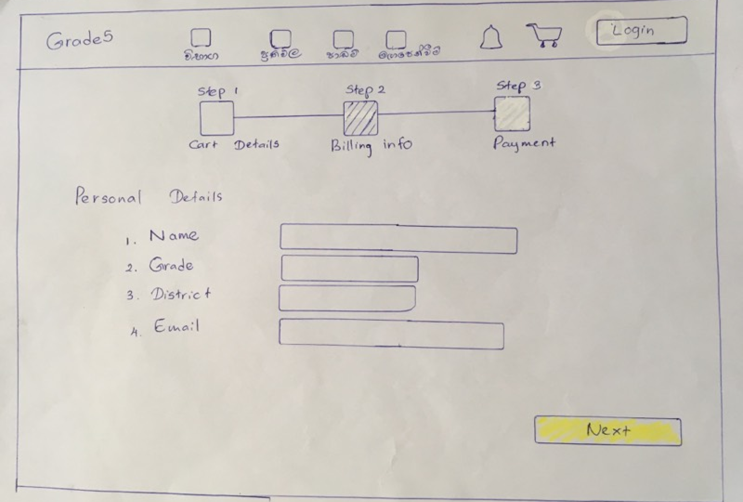
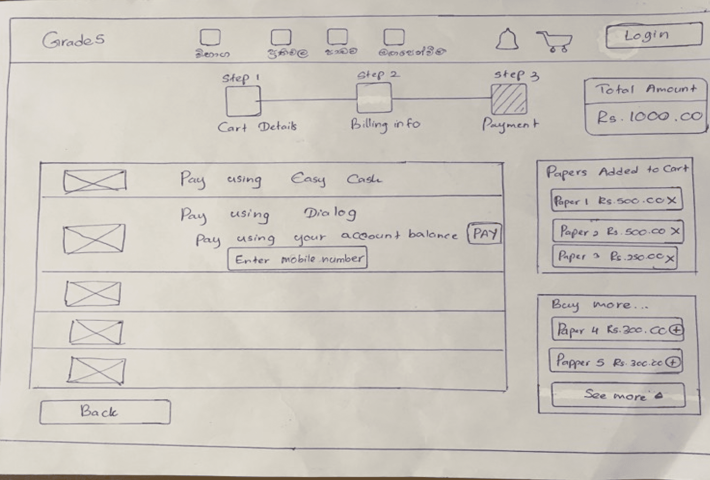
I joined the team as an Intern UI/UX Engineer and I collaborated with the team to research similar applications in the market, brainstorm new ideas for the second phase of the application, created sketches wireframes, and presented them to the client. After the client's approval for the initial ideas I created visual designs for several areas in the application such as the landing page, cart UI, billing info, payment options with a mini cart, my papers, inside a question paper, results, log in and other popups and etc.
I also helped the team with UI styling using Bootstrap and CSS. I did most of the UI styling including above mentioned UIs and did question paper sub-navigation styling, help section styling, made responsive UIs, and fixed UI and responsiveness issues. I also created graphics assets for the related UI as well.
The challenge
Most of the users were not tech-savvy as expected from early on. The majority of them were using an educational application for the first time. Along with that, device and network usage issues in rural areas were there as well. Especially when LIVE exams were conducted during a specific time frame for all the users. Online payment methods were a new concept for most users as well.
Design Process
This experience was a huge cross-discipline effort. Design, narrative, strategy, and development all started on day one. Sketching, brainstorming, prototyping, writing, and researching all together. This agile workflow allowed us to experiment and get to the best ideas faster.

User feedback
Data analysis

Brainstorming
Low fidelity wireframes
Paper prototyping

Mid fidelity wireframes
Interactive prototyping

User interface
Interactive prototyping

Developer handoff
UI development and interactions
User Feedback and Data analysis
We had great success than expected with the first release of the Grade5 application with over 10,000 user registrations.
Since the call center was handled by the team at Crowderia, we were able to identify the pain points of the user very effectively. It was not an easy task for the team to handle 24h customer support with over 7,000 appreciation calls plus, nearly 10,000 inquiries on introductions and support.
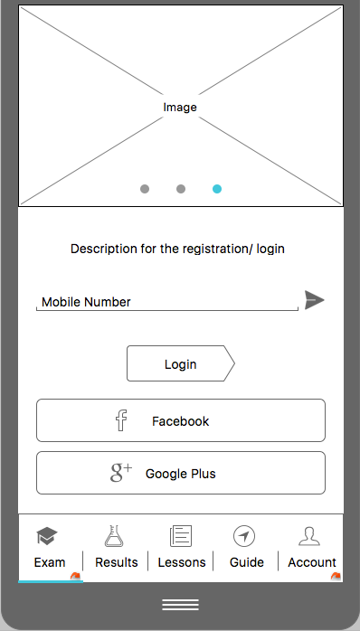
One of the main updates we suggested and implemented for the second phase was the ability to go through the application on both mobile and web prior to the registration and login steps. So the user can get some insights into what exactly is offered within the application once they sign up with us.
While we were researching the first application, the analytics showed us that the user base drastically bounces off at the login process. Therefore, especially in the registration and login process, we have minimized the effort users have to put in order to get into the system by only requesting the mobile number and verification code. Whereas in the earlier version user had to fill up a form with five fields of information at the registration.
Brainstorming
Brainstorming sessions with the team were very effective even though it took a longer period of time with information structure management, discussions on the thinking process, and understanding all of those.
For starters, we spread out and sketched individual ideas on the areas we discussed. Then we had further discussions evaluating all of those ideas put together - identifying the most suitable ideas for the expected outcome. We kept it going iteratively making improvements each time.
Our main focus was to make the user experience as effortless as possible even though the user could be far away from being tech-savvy.
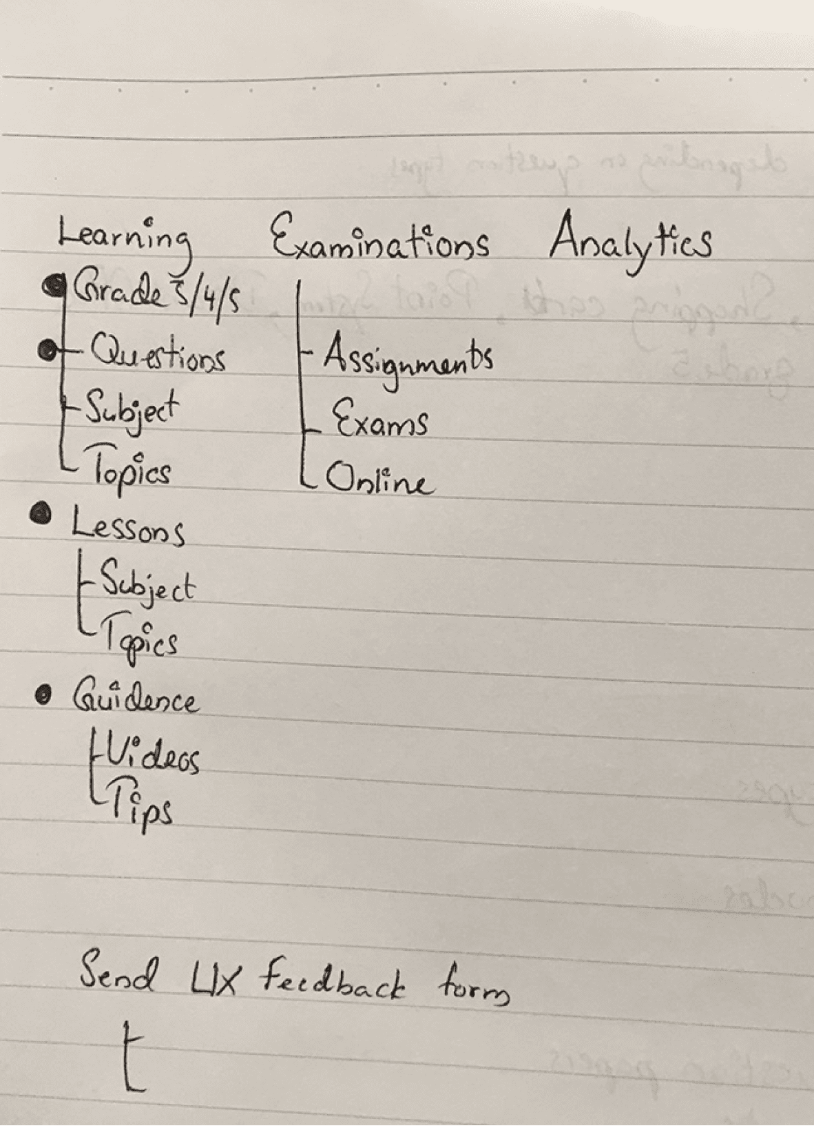
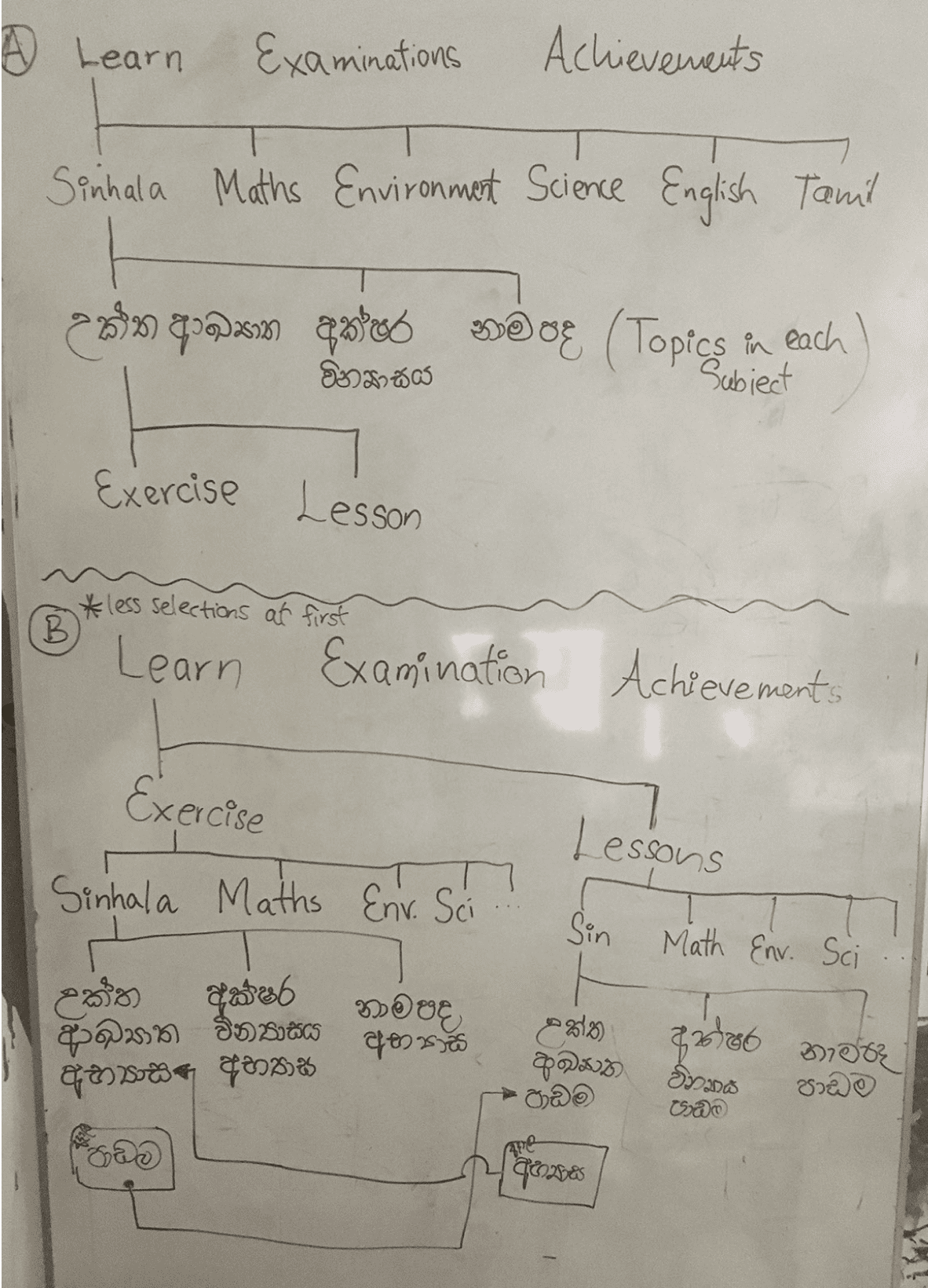
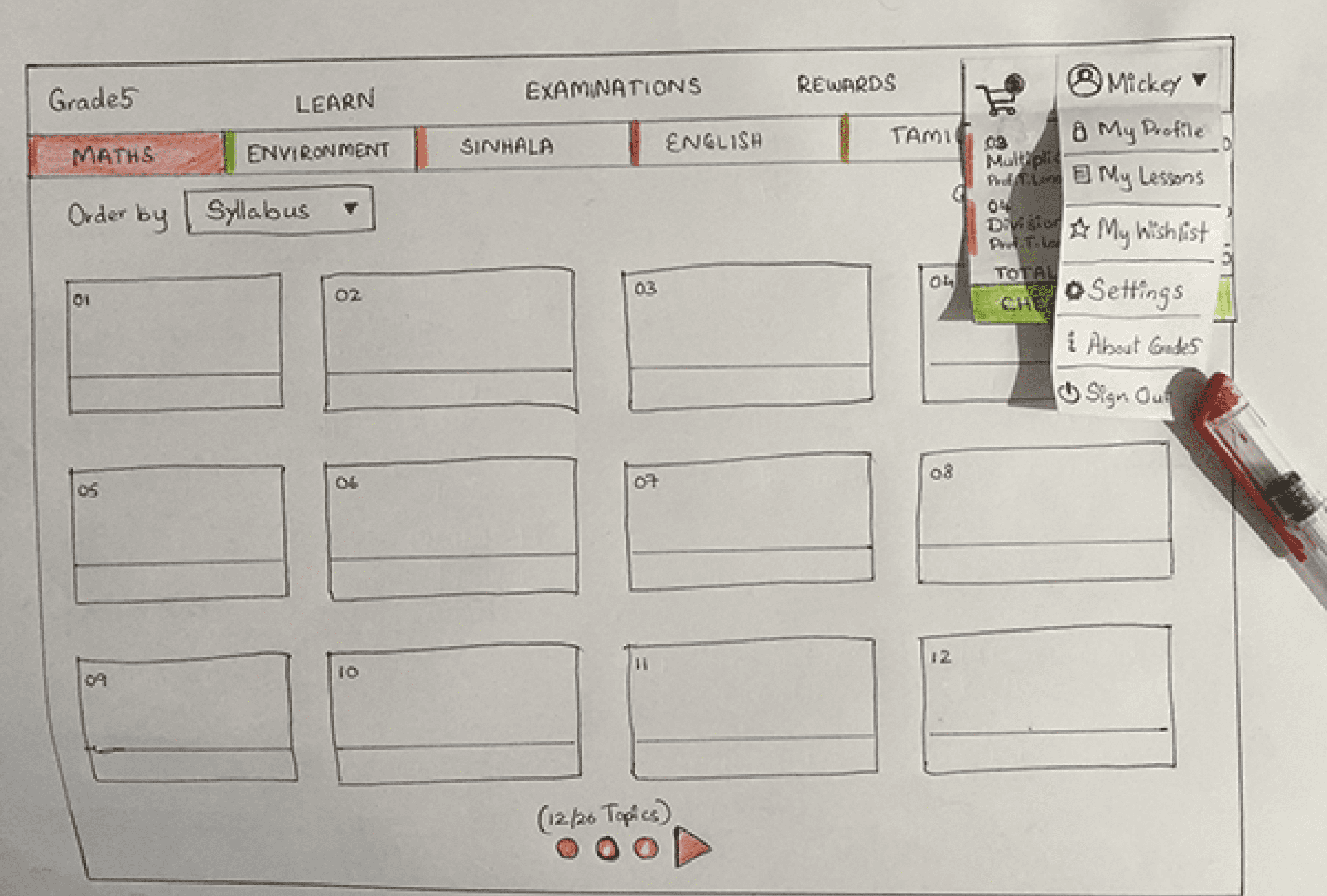
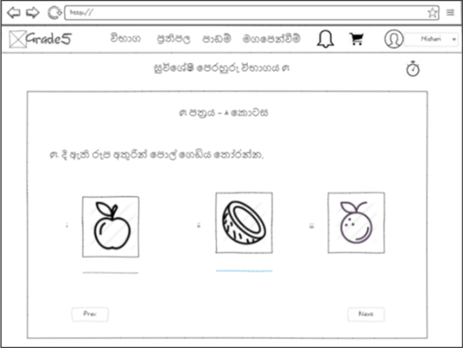
Low Fidelity Wireframing
Once we had a somewhat clear idea for ourselves on how everything should be arranged in the system, we moved on to creating basic wireframes on paper with pencils, pens, colored pencils, and whatever we found useful to make it all clearly identifiable to anyone who would pop in for a brief discussion or occasionally scheduled meetings to discuss on the on-going progress.
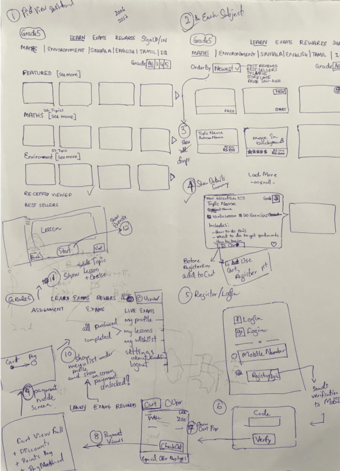
Paper Prototyping
We wanted to try out a paper prototype including all the screens and flows presented in a way we can discuss the entire process without depending on more technical prototypes which show one screen at a time. With a couple of extra nights put into the effort, we were able to get paper prototypes on time for the next scheduled meeting with the majority of the internal team who were working related to the project.
Mid Fidelity Wireframing
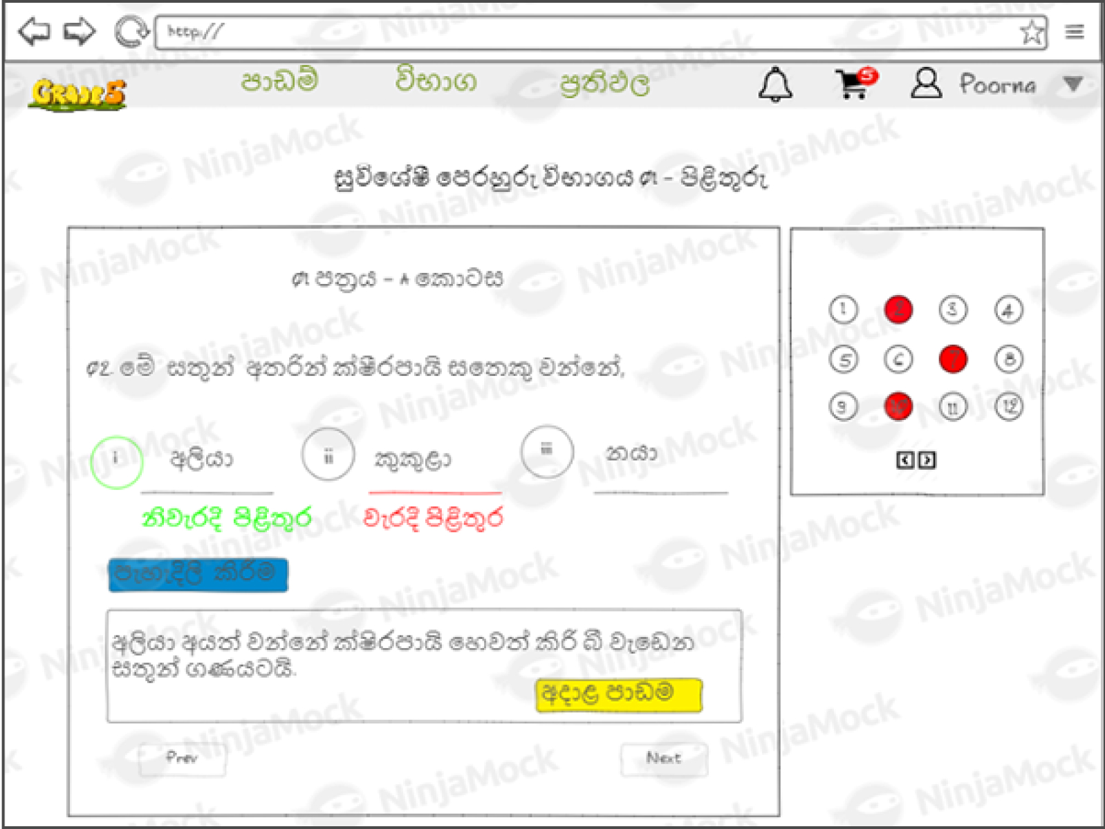
Once the overall mockups and flows were satisfactory and agreed upon, another challenging section had begun. That was designing the improved user interface targeted at Grade 5 kids as well as parents.
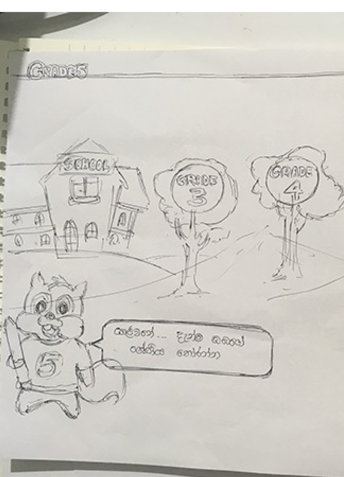
With the feedback we received for the first version of Grade5, the majority of the users(all I guess) were satisfied with the design solution presented with the character and background designs to make it as entertaining as possible for children - without taking off their focus for educational aspects as well.
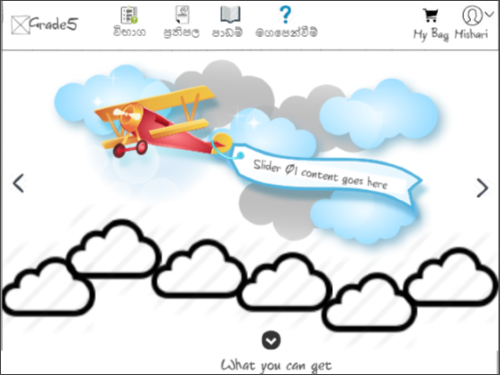
Now we had to come up with a much better design solution compared to the previous one. In this stage, most of the designs achieved the expected outcome with the efforts of Me and Poorna; where I came up with the idea of expanding the existing environmental designs. Allowing the mascot 'Vidu' to explore Grade5 world from sky to deep sea level with his fifth-grader friends.
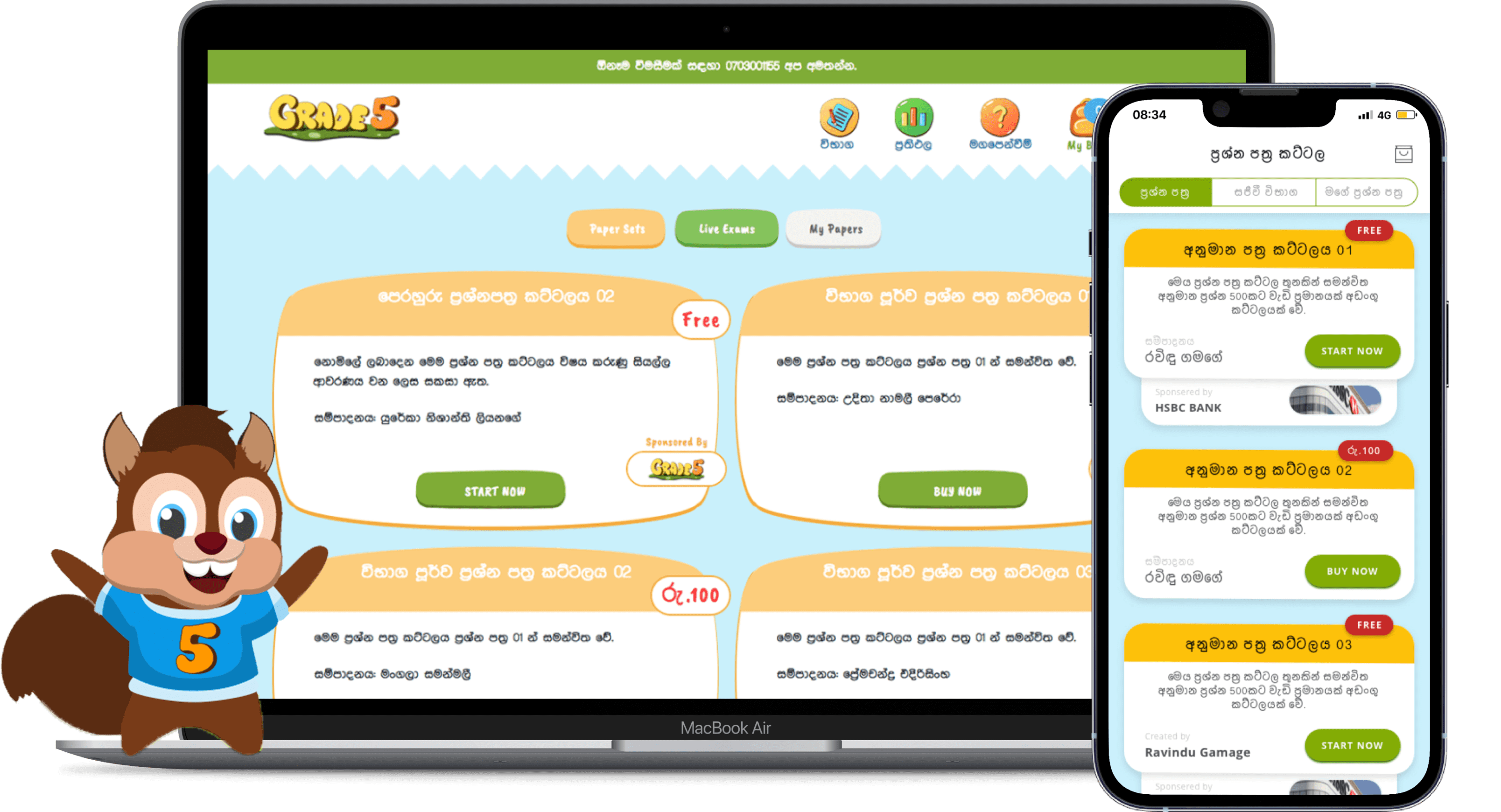
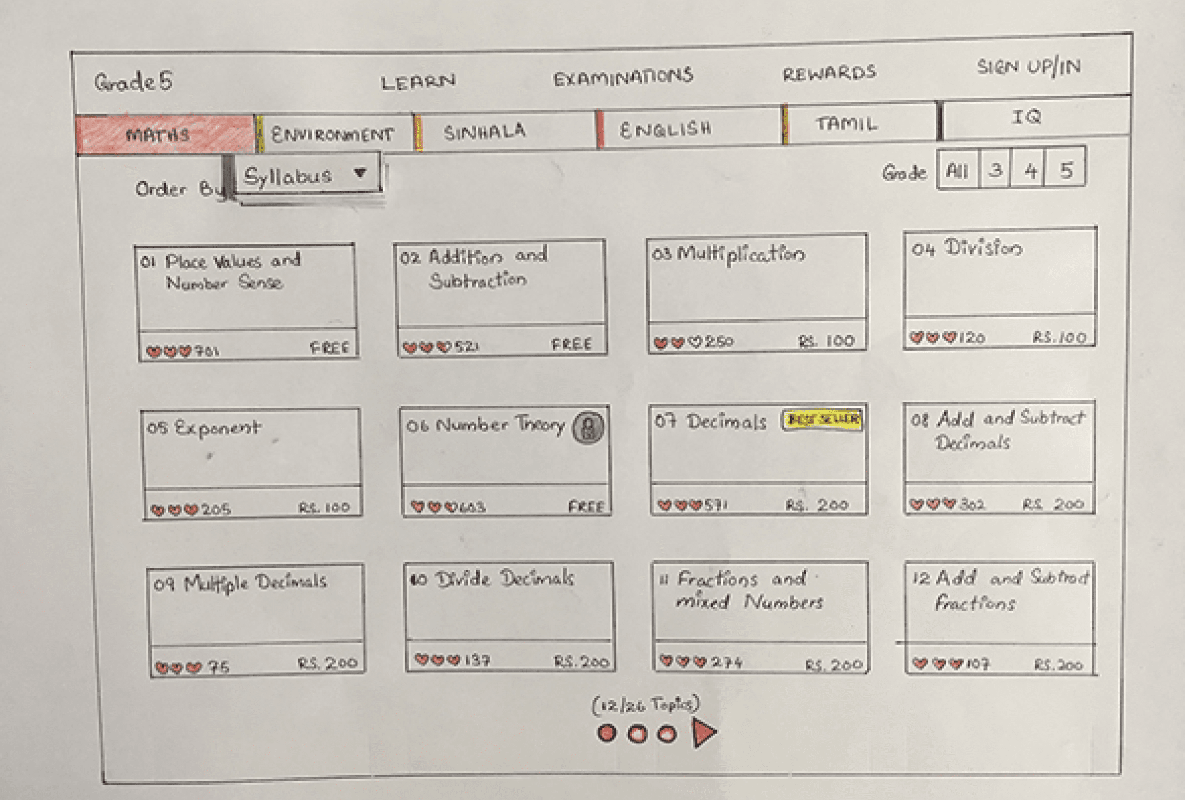
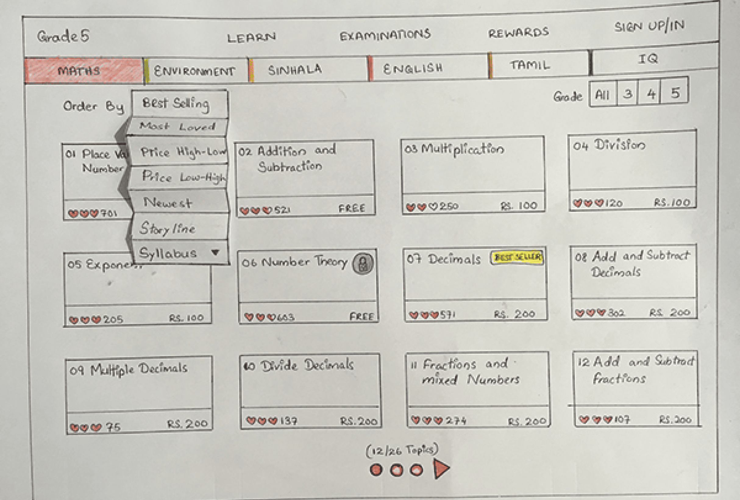
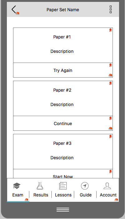
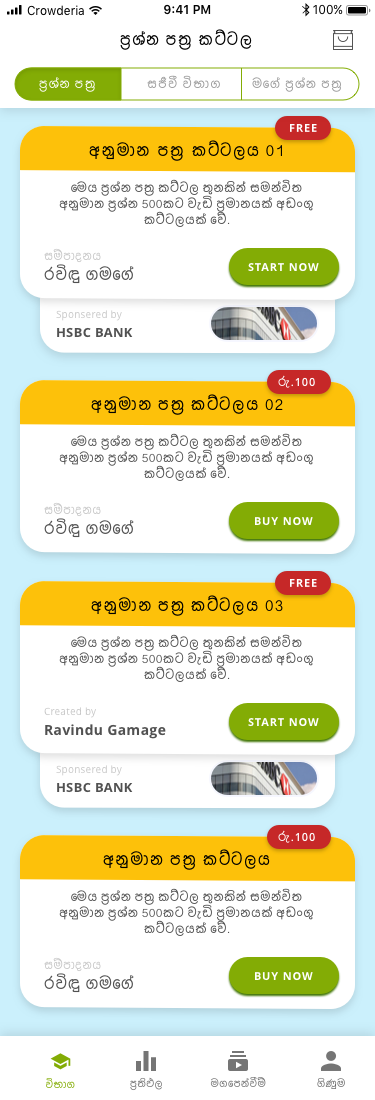
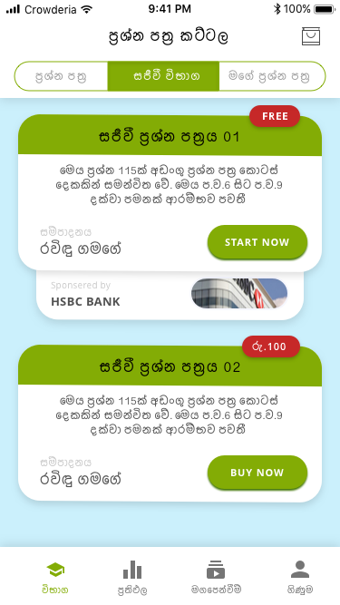
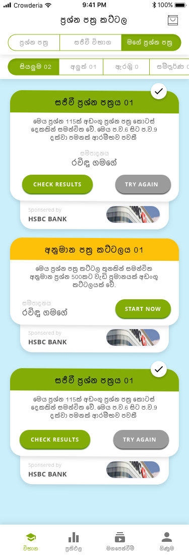
We thought of making color codes in order to identify the type of paper sets without much effort. As a solution, we came up with Paper Sets in yellow, LIVE Exams in green, and Term Tests(this type was temporarily disabled for the upcoming version) in blue color codes. And then made the overall look and feel into a fluffy look with Jelly-beans sort of buttons and assets. We wanted to keep it effortless for development as well as consider the efficiency of the site when it comes to the low bandwidth situations in rural areas.
User Interface
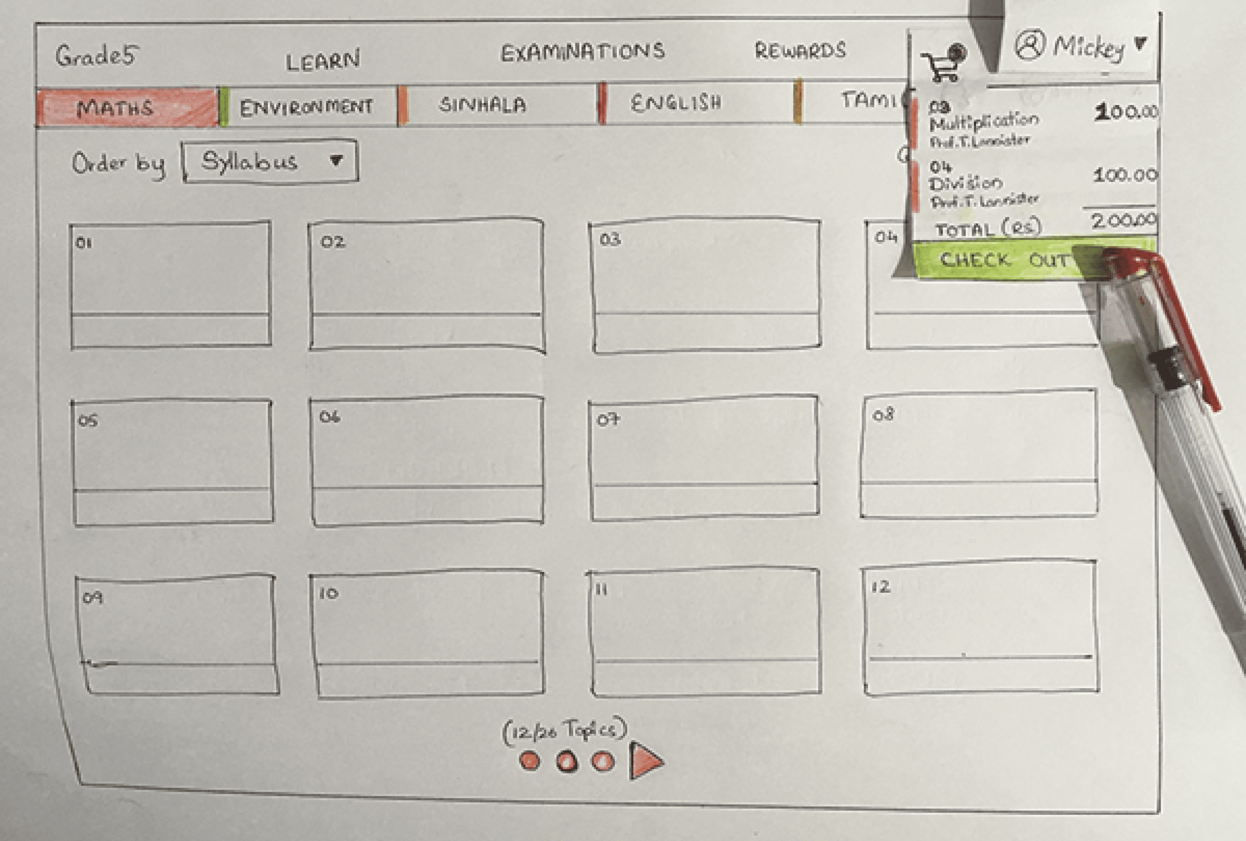
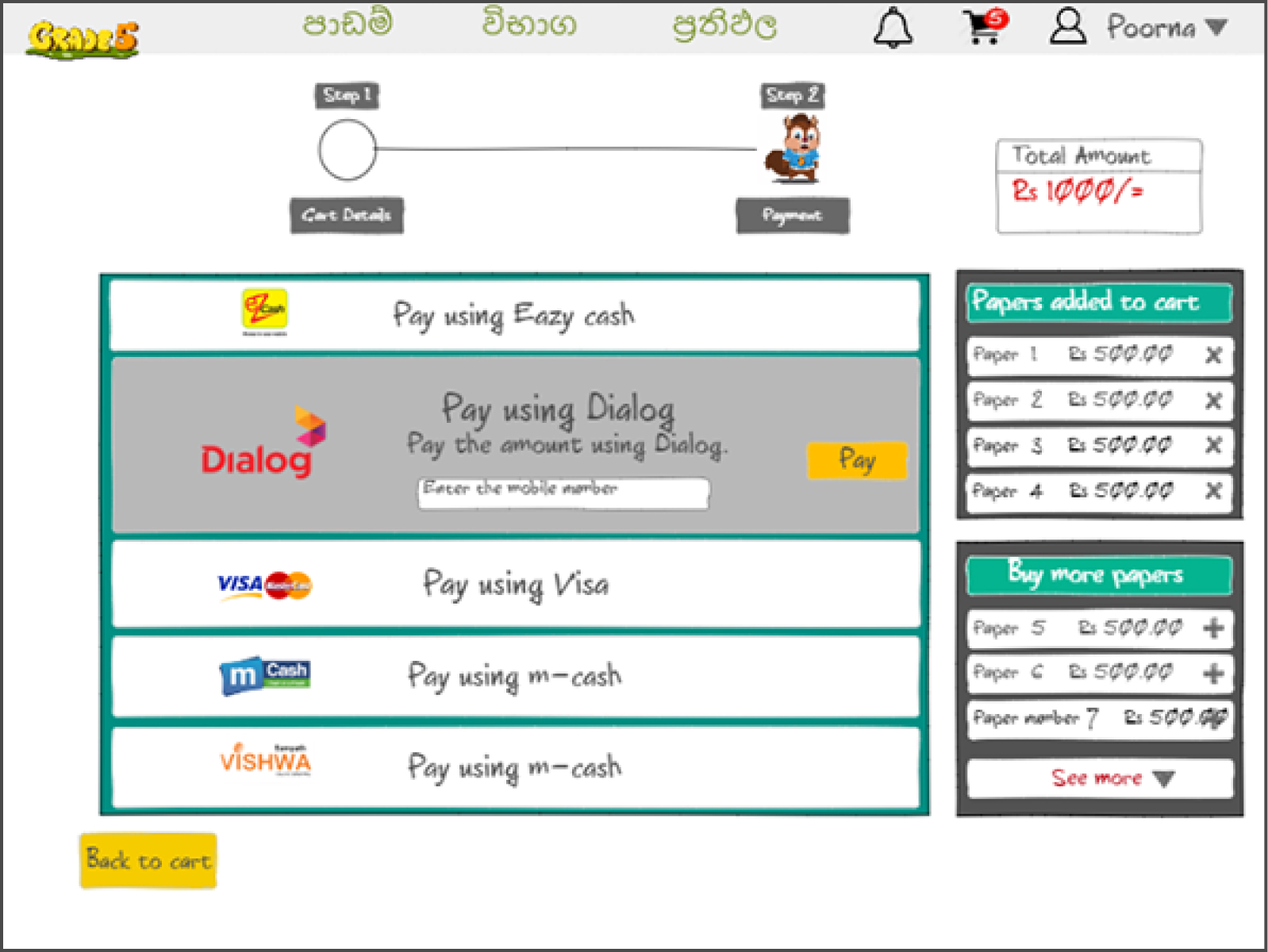
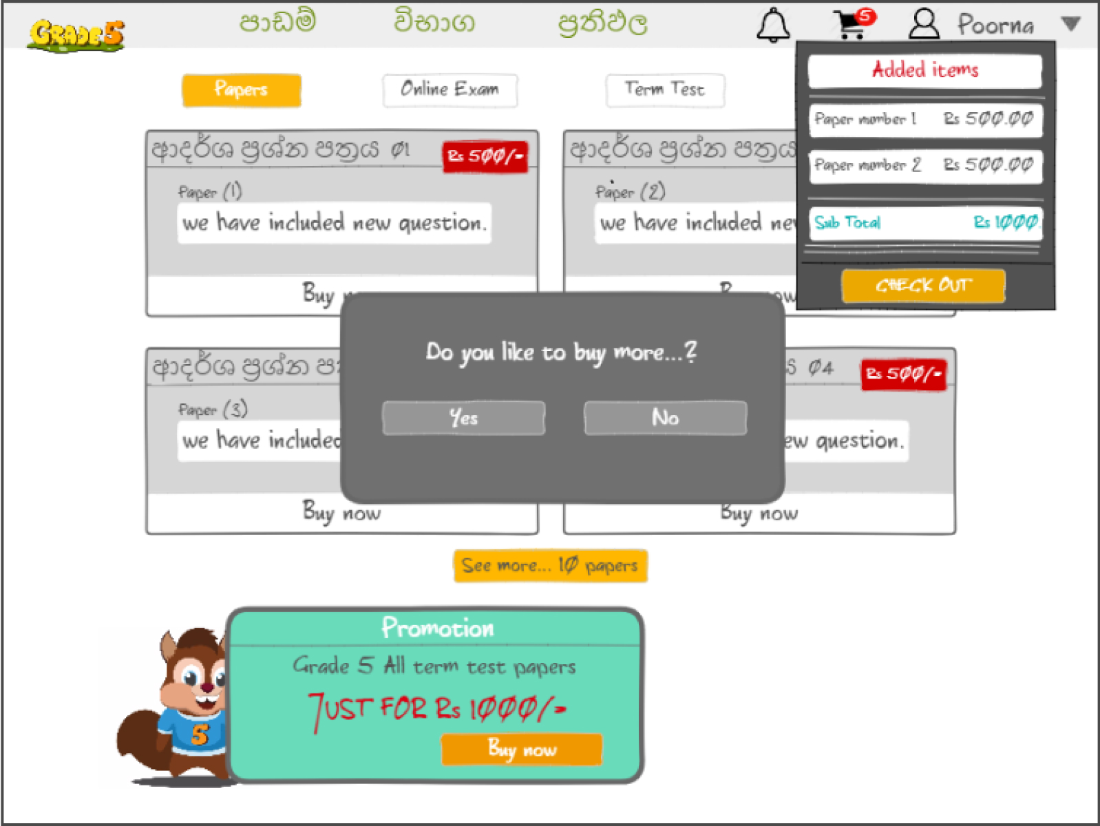
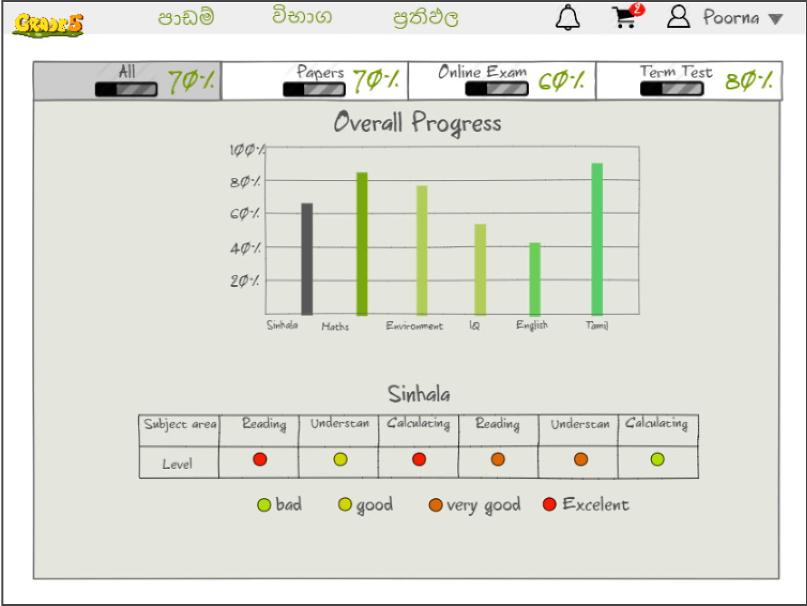
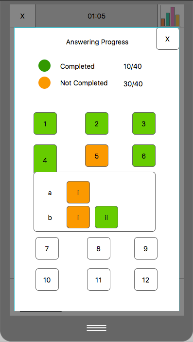
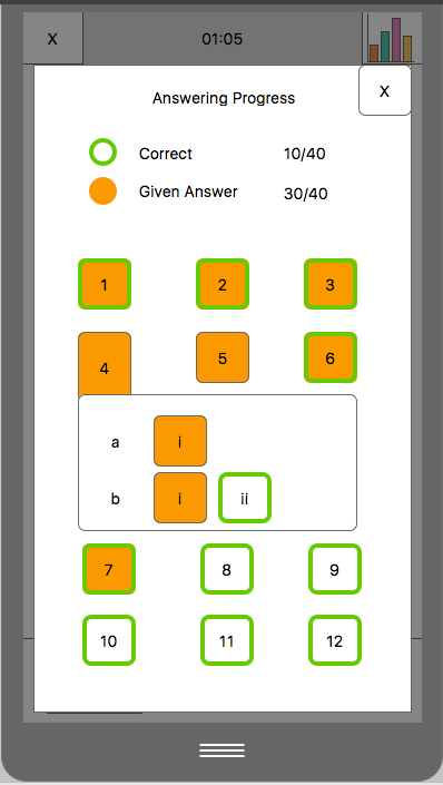
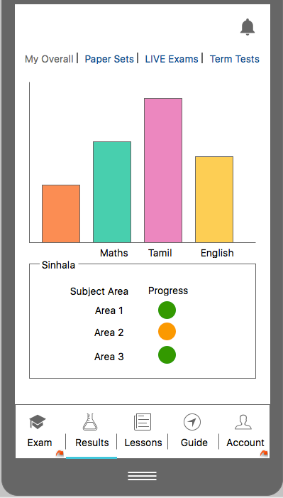
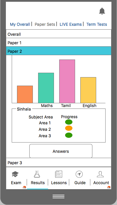
After going through several discussions with the stakeholders and the entire team, areas to be focused on in the next steps were decided. Using ninjaMock and similar tools we started mocking up the solution we came up with. It was focused on checking the progress of user results, payment flows of multiple items(bulk payments), categorization of the paper set types, and the landing page for the first time and returning users.


Navigate within the app without logging in
One of the main updates we suggested and implemented for the second phase was the ability to go through the application on both mobile and web prior to the registration and login steps. So the user can get some insights into what exactly is offered within the application once they sign up with us.


Simplified log in
While we were researching the first application, the analytics showed us that the user base drastically bounces off at the login process. Therefore, especially in the registration and login process, we have minimized the effort users have to put in order to get into the system by only requesting the mobile number and verification code. Whereas in the earlier version user had to fill up a form with five fields of information at the registration.

Wireframing the Mobile Version
Apart from the web application, in order to make phase two of the project a success we made an update on the mobile applications including new features as well.
When it comes to the mobile app, we have identified that the previous version could get slightly confusing and the flow of the application was not effective as we expected. Therefore we sketched out the flow from the beginning and worked on making it as similar as possible to the web application flow in order to make it easier for the users to switch in-between and navigate through naturally.
User Interface for the Mobile Version
In order to meet the deadlines and to get the output as soon as possible, we have used the "UX is the new UI" concept. Where we didn't proceed to a more specific User Interface Designing for new mobile application versions.
Instead, we used the mockups and flows we have carefully crafted to maintain the balance of both web and mobile applications and a natural user experience. Thereafter we applied the new UI theme for Grade5 which was used on the web application as well.

Takeaways and challenges
Within a couple of months, we were able to achieve the target version of the application.
One of the main struggles we had was, to get the exact design elements we wanted to be on the new version - with minimum weight on the application in order to maintain flexibility for the users with low bandwidths. Most of the graphical elements were in SVG format since it would maintain the quality we expect on the designs throughout all devices. Wherever it was not possible, we have used PNGs as well. Which helped in keeping the file sizes compressed as much as possible, without much loss of quality. Because generally, SVGs in their vectorized form are the lowest in size. But, when it comes to the graphics with shadows and more detailed designs SVGs could get quite heavy, especially if used as image files rather than using SVG code itself in development, which would make the source code too crowded.